Back to Tutorials

Data Visualisation - For Loops
Learning Objectives
We are going to learn:
- How to iterate through lists using
forloops.
Exercises
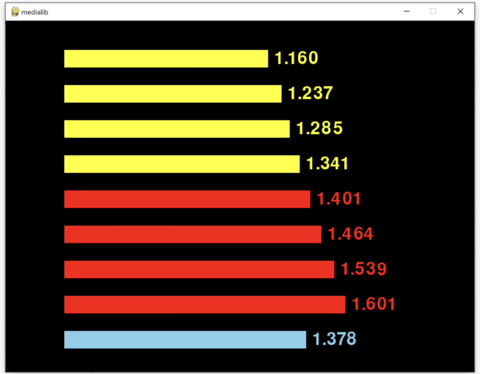
Download the Medialib ex6 files from the gallery and complete the program in ex6.py to visualize a list of data and their average with horizontal bars according to the following example and the comments in the program. You can modify the program you made in exercise 2, but the program now has a longer data list and needs to be more concise.
- On line 38, use a
forloop so that the program will now be able to deal with more data. - On line 40, complete the program so that it can calculate the coordinates (x,y) and lengths of each bar when looping through the data list by using the index number.
- On line 45, check if the data value is above the average. If it is above average, the bar should be drawn in a different colour as shown in the red bars below. The blue bar is the average data value.


This work is licensed under a Creative Commons Attribution-ShareAlike 4.0 International License.